


The inspiration for your next visual content project is probably hiding right under your nose. Here are six easy ways to find your next standout piece.
Get Started for FREE
Sign up with Facebook Sign up with X
I don't have a Facebook or a X account


 Your new post is loading...
 Your new post is loading...
Your new post is loading...
The inspiration for your next visual content project is probably hiding right under your nose. Here are six easy ways to find your next standout piece. 
No comment yet.
Sign up to comment
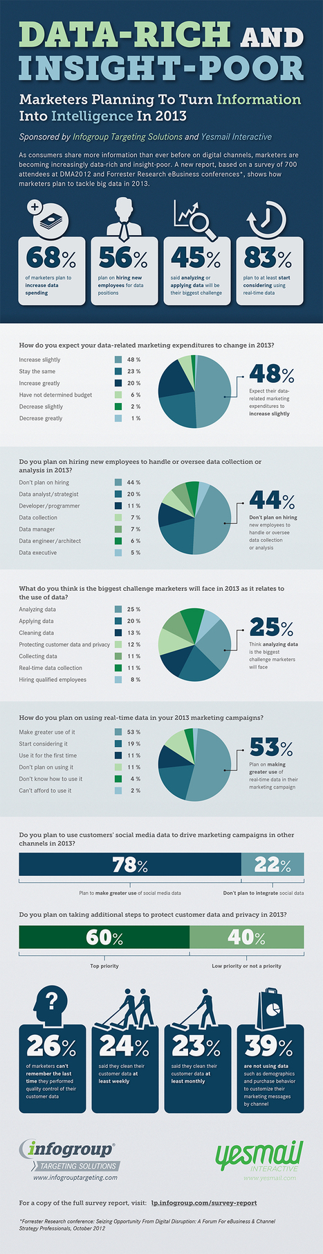
Marketers are all over big data - but are they looking to big data at the expense of true insights and missing the heartbeat of their customers? Via janlgordon

William J. Ryan's curator insight,
March 4, 2013 8:35 AM
Same can be said for learning as well, we track a lot in LMS's but are we measuring what matters? Have we defined, and agreed upon, the metrics that will help the business and the performance of the community we serve? 
Irina Radchenko's curator insight,
August 13, 2013 7:32 AM
Today’s connected consumer has access to an insane amount of information, all at their fingertips, thanks to the ubiquity of smartphone access to the web.
From checking restaurant reviews and stock prices, to taking pictures of a new pair of jeans and asking the opinion of friends on Facebook, today’s consumer is no longer restricted to choosing a brand through a push marketing approach.
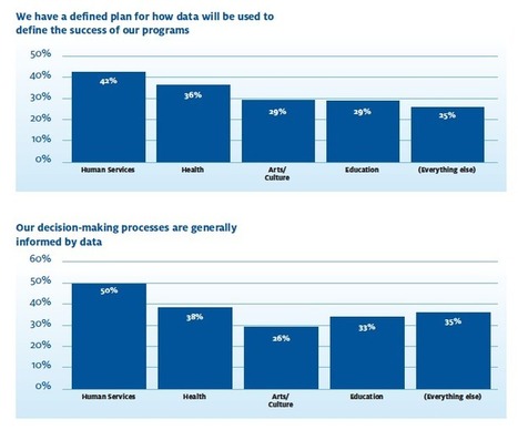
Between the 2012 U.S. election, Big Data, and online listening, data is the topic of the moment in nonprofits and business. Today, we take a look at "The State of Nonprofit Data" - a new report from NTEN and Idealware.
|
Your one stop shop for all you need to know about visual storytelling: http://t.co/ugfABM7nU4

Barney Bassnett's curator insight,
April 20, 2013 2:52 AM
Yet anther great scoop from the awesome Karen. Thanks Karen 
Denyse Drummond-Dunn's curator insight,
April 20, 2013 12:27 PM
The video about editing in particular is definitely worth its 9 inutes viewing time. 
ozziegontang's curator insight,
April 22, 2013 7:34 AM
Thanks to Zach and Team Juice for a site with insight on telling stories using data that is outa sight for all that is shared. II thank Karen Dietz of www.scoop.it/t/just-story-it for the cite. Look for her book coming out in the fall on storytelling for business.
For many data visualization projects, information comes from a source that has already done some aggregation. This is both a blessing and a curse. Aggregation definitely simplifies the analysis and visualization process, but it can also greatly reduce the visualization and analysis options. This is because aggregation often destroys connections in data. For this reason, it's critical to have an in-depth and thorough knowledge and understanding of the information from aggregated information. There are several different visualization techniques that open up once we have the original data, such as Euler diagrams and parallel sets. The extra information that can be obtained from visualizations is important to gaining a full understanding of the data, and it can lead to a much more interesting story, as well as far better visualizations and more accurate connections and links within those visualizations. So, when gathering data about something, remember to dig deeper into it, as there are many important connections that happen within data that can provide knowledge beyond just a simple average or total. To learn more about the value of these connections, sourcing accurate data, and how it is transformed into useful graphics, read the complete article and check out the case study used to convey the main points outlined above... Via Lauren Moss

kurakura's comment,
November 15, 2012 5:17 AM
the last graph on that page is really useful for understanding the data?
From
prezi

Turn tweets into action by looking at Analytics and making data actionable.
|


Good tips on where to find the data for your infographic.