 Your new post is loading...
Online merchants could always use some free expert advice from the design community. There is a wide variety of free ebooks available to help. Here is a list of helpful ebooks on design. There are titles on typography, classic design, color theory, user-experience design, logos, brand building, creativity, and more. All of these ebooks are free.
The logo is the most essential part of making any brand recognizable. Hiring a professional designer to create a custom logo can definitely be expensive, especially for most small business owners and individuals who don’t have the budget. Fortunately, there is a seemingly endless supply of Web-based solutions to help you create logos with relative ease - and these are some of our favorites. Once you're done, head on over to Logo Rank, an AI tool that critiques your new logo design. ...
Websites that are considered as modern and fresh today, will not be treated in the same manner tomorrow because Web design trends are changing constantly with time. Professionals associated with the industry are aware of the fact that every year brings new challenges and opportunities in the field of web design and development. Therefore, it is important to know how to make them flexible and adaptive towards the rapidly changing trends of website design. Here, we have put together a list of web design trends that will have a bigger impact in 2018....
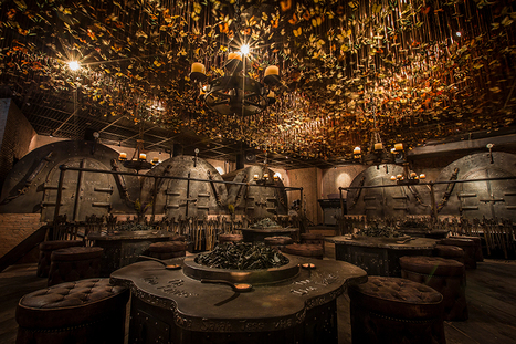
Named ‘the iron fairies’, the mysterious interiors of this bar conjures up scenes from a fairytale book or Lord of the Rings. With three locations: Bangkok, Hong Kong and Tokyo, the underground den is reminiscent of a blacksmith’s workshop; reflected in the iron, timber and leather materiality and the curious decorations all across the eclectic interior. Created by designer Ashley Sutton, a distinctive element of the iron fairies is the ceiling enveloped with 10,000 preserved butterflies that suspend over the main ‘workshop’ room furnished with low seating and circular tables. Rooms branch out to form individually designed ‘furnaces’ and ‘casting rooms’, offering private spaces for smaller groups. The element of enchantment is distilled into every detail of the bar interior, with the concept itself deriving from sutton’s days working in the underground iron-ore mines in Western Australia. With this, the décor follows a fantasy imagined by the designer where ore miners stumble upon little winged spirits, mixing roughly hewn wood, massive rusty cogs, rickety piping, and walls lined with vials of fairy dust....
Appealing to the emotions of your website users is nothing new and certainly something that marketers and branding experts will have plenty of experience and specialist knowledge of. But because the online world is becoming so saturated with content, and because first impressions count, making people feel instantly at home on your site has never been more important. With SEO copywriters working hard on telling that all-important brand story and stunning images that inspire and uplift your visitors, you might think you’ve got everything covered. But if you haven’t looked at your use of colours in a while, you might be missing a trick. The simple fact is that colour is the first thing that visitors assimilate when they arrive on your site. It comes before images, typefaces, body copy or other online content, and without people even realising it, can change the way they think and act. Humans are programmed to equate colours to emotions, so whether you aim to soothe, energise, excite or promote trust, it’s essential to choose your colours wisely....
In the 1970s, designers were treated as rock stars–album cover designers, that is.“You were regarded almost like the fifth member of the band,” says Aubrey Powell, whose studio Hipgnosis was responsible for the album cover designs for artists like Pink Floyd, Paul McCartney, Genesis, and Led Zeppelin. A new book, Vinyl. Album. Cover. Art, revives Hipgnosis’s complete catalogue, displaying 480 illustrations from the studio’s archive. It’s a glimpse into a pre-digital era when a single illustration could take months to complete. Hipgnosis got its start in 1968, when Aubrey Powell and his creative partner Storm Thorgerson were asked to do an album cover for their friends’ second album. Lucky for Powell and Thorgerson, their friends happened to be the members of Pink Floyd; lead singer and guitarist Syd Barrett was their roommate. At the time, Powell was sneaking into the darkrooms at the Royal College of Art in London, where Thorgerson was a student, and experimenting with infrared film....
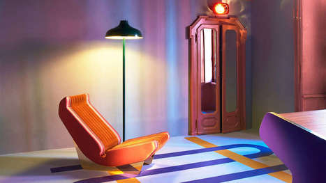
Less is a bore, as Robert Venturi once said. Minimalism has held a tight grip on the modern design industry for the past decade. We embraced the Apple aesthetic, extolled the logic of Helvetica, and worshiped at the church of Dieter Rams. It served its purpose, most recently, as a correctional to the excesses of the 1990s. But lately, as dispatches from Milan Design Week have shown, asceticism has given way to audacity. Every April, hundreds of thousands of people trek to Milan for its trendsetting design week, which ultimately influences the furniture, accessories, and textiles that make their way into homes, offices, hotels, restaurants, and virtually every other interior. This year the artistic influences ranged from ’30s art deco to ’70s eclecticism. Designers and manufacturers experimented with digital fabrication–like 3D knitting–and rediscovered artisanal craft techniques, like lacquering, metal casting, and jacquard weaving. But one thing was consistent: They’re embracing luxurious materials and textures, testing ambitious silhouettes, and piling on the details to yield products and furnishings that are visually enticing and emotionally evocative.In other words, minimalism is dead; maximalism has arrived....
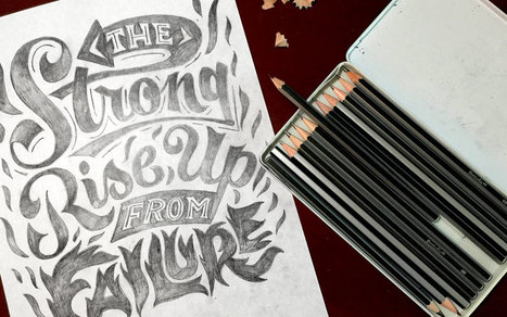
Everyone, even non-designers, can agree that the smallest typographical change can make a world of difference (*cough* Warren Beatty *cough*). Elevating designs through typography is a skill every designer should have in their back pocket. Do you want to become a typography wiz—and, ultimately, an even better designer? We want that for you too! That’s why we’ve gathered a list of the best free typography resources—handpicked, just for you. Free typography education Check out these e-courses, e-books, and workshops to get started on your typographical journey....
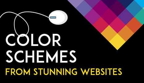
Color is such a fundamental part of the way we perceive the world that we often take it for granted. Think about it: From the youthful and vivid orange on someone’s attire to the gray and gloomy sky above us, colors have the power to mold our perceptions of others and even the circumstances we find ourselves in. This is why one of the most powerful tools in a designer’s arsenal is color. It can either make or break a design; it can be the determining factor in engaging viewers or sending them promptly on their way. As a non-designer, I often find it difficult to find just the right colors for my amateur projects. Whether I’m creating a simple image to support my content or more elaborate projects such as a slide deck or infographic, I frequently spend a good amount of time looking for the perfect color scheme. I ask myself questions like: Do I want my design to be inviting? Provocative and bold? Or intelligent and elegant? Unless you’re a seasoned designer, it takes time and effort to find a color combination that works, which is why the design team at Visme decided to provide our users with a handy list of beautiful color schemes from websites that have been recognized by Awwwards, the most prestigious award for Web designers and developers....
Editor’s Note: In the world of web design, we tend to become preoccupied with the here and now. In “Resilient Web Design“, Jeremy Keith emphasizes the importance of learning from the past in order to better prepare ourselves for the future. So, perhaps we should stop and think more beyond our present moment? The following is an excerpt from Jeremy’s web book. Design adds clarity. Using colour, typography, hierarchy, contrast, and all the other tools at their disposal, designers can take an unordered jumble of information and turn it into something that’s easy to use and pleasurable to behold. Like life itself, design can win a small victory against the entropy of the universe, creating pockets of order from the raw materials of chaos....
An artist in California is replacing garish billboard ads with nature photos that blend almost perfectly into the surrounding landscapes—because they show the landscapes themselves. Jennifer Bolande’s “Visible Distance/Second Sight” is gracing roadside scenes along Gene Autry Trail and Vista Chino in Palm Springs, California. When a viewer sees the outdoor posters from the right perspective, the large-scale images of the mountains in the distance align with the actual ranges, creating a striking juxtaposition of the virtual image and the real one. Part of a broader “Desert X” exhibition in the area, it’s meant to redirect attention from the advertisement to the natural world depicted in it. It’s been done before, to a degree. As we pointed out in 2015, artist Brian Kane’s work in Massachusetts used trees and stars to similar effect....
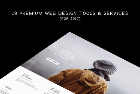
There are many new web tools and services for designers and developers launched every month, but how do you know which are the most useful? Which offers the best solution for a project? And which offers the most value for money? We’ve managed to collect a mix of premium web tools and services covering many areas of web design, that are worth trying out. Take your time, go through the collection, and find the tool that best suits you. Here they are....
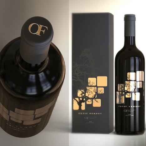
Your label is one of the first thing people are going to notice about your bottle. And a label can tell you a lot about the wine inside: what kind of occasion it’s best for, whether it’s a red or a white (or a sparkling or a rose), what varietal it is, what type of flavor to expect… seriously, your customer is drawing a LOT of information from your label. And because they’re looking for your label to get all of that information, you want to make sure that your label is an accurate representation of who you are and what your customer can expect from your wine. It’s a big deal! Here’s a roundup of 30 of our favorite cool wine labels for inspiration...
|
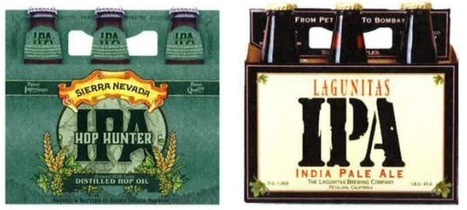
Ten years ago, a lot of breweries found they could get away with soliciting a friend to design their beer packaging. Not anymore.
With so many beers competing for attention on the shelves, standout beer labels have become a critical part of any brewery's marketing strategy.
So which breweries have come up with those really standout designs?
Logo Crunch is a multi-resolution logo maker, it uses computer vision to make your high-res logo legible at lower resolutions. Use it for a website favicon, iOS app icon or Android app icon.
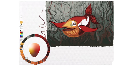
While many imaging apps’ tools closely resemble those used by artists in the real world – such as brushes and pens – the color picker feels like a completely digital device. A new project from the folks at Adobe Research and University of Toronto reimagines it as a skeuomorphic palette that’s designed to be more natural and intuitive, while allowing for the creation of harmonious color schemes and works of art. Instead of forcing users to choose from colors from across the entire spectrum, Playful Palette presents you with an interface that’s more like how you’d mix paint in real life. Pick a bunch of colors represented as paint blobs, make a puddle with them, blend them with lighter and darker hues by pushing in different directions and get a gradient of colors to work with. Hit ‘play’ on the clip for a better idea of what I’m talking about:...
As we said in the “9 graphic design trends you need to be aware of in 2017”, this is the year when we are witnessing a growing desire for counterbalancing the doubt with authenticity and simplicity. And we can see this not just for general graphic design trends, but also for web design, packaging, print design and especially for logo design trends. That said, let’s take a closer look at the logo design trends that define 2017. Some of them are new, other are older trends that confirmed the last year and will become more popular in 2017....
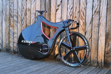
Titled after the portuguese word for feather, the ‘PLUMA’ track bike lives up to its namesake with a lightweight body and elegant shape. designed by Nuno Teixeira industrial design, the ‘PLUMA’ concept was dreamt up back in 2010, and after one year in production the first prototype is ready to hit the track. With a carbon sandwich and AIREX R63.80 PCV foam frame, the pluma bike sports a curvy physique to help air flow along the bike’s body. The streamlined bicycle aims to be feather soft as well as feather light, reducing the number of exposed moving parts and tubes to prevent injury to the rider in case of a fall. with a PRO track carbon disk rear wheel to minimize drag, and a PRO 5 spoke carbon track wheel at the front, the curvy ride carries no unnecessary weight. like the majority of professional velodrome track bikes, PLUMA is a fixed-gear model, and comes without breaks. Nuno Teixeira industrial design’s elegant bicycle has been taken from render to reality by constellation composite, specialists in turning concept transport designs into working physical pieces....
The Netflix queue is one of the most dangerous time-sinks on earth. But to designers, it can actually be a great source of inspiration, with everything from design documentaries to films that are pure visual art. Here are 22 must-see design movies and shows on Netflix....
I launched Typewolf as a side project in June of 2013. Working as a designer, I was always frustrated by the lack of good resources for choosing fonts for design projects. Seeing type samples set in “the quick brown fox jumps over the lazy dog” isn’t very useful when it comes to web design—seeing how real type performs on actual websites is much more helpful. I’ve also noticed that other typography sites tend to be written from a type designer’s perspective rather than from the perspective of someone who actually uses type in their day-to-day work. I’ve been a designer for 15 years, so everything on Typewolf is approached from a designer’s perspective....
There is a big misconception about the role of web design. Many people see design as the lipstick, the visual appeal of a website. But your website should be more than a pretty digital brochure. Web design is a tool that can help you achieve specific business goals. For B2B companies, web design should be working towards increasing the leads you get from your website. Good web design can help increase your conversion rate and engagement with your content, funneling leads down your marketing funnel towards a sale.
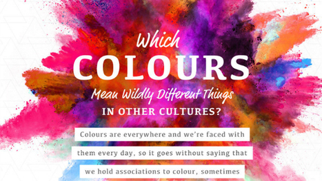
One of the most fun things to do in design is swirling the latest color trends into your work. Color is a fascinating topic, and even a generator that understands color theory has recently been invented. Because they mean different things, companies also actively use color in their brand designs to encourage feelings and behaviors from customers. However, in different cultures, color theory isn’t all black-and-white. In this delightful infographic, SilverDoor describes color associations of different cultures, adding contrast to the way you think. Telling a person from another part of the world that you’re “feeling blue” may mean something entirely different to them. Is your favorite color offensive to another culture? Find out in the infographic below....
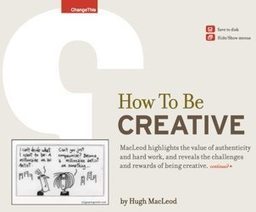
EMany of us bemoan the fact that creativity seems to be in decline in America.Research by KH Kim finds that the ability to think creatively is down among children and adults, which suggests they may be less able to come up with creative solutions to problems. This trend worries those in the business sector and beyond, who fear it could spell disaster for the future of innovation. But what if the biggest block to creativity isn’t the inability to come up with new ideas and solutions to problems, but our inability to accept and recognize them? This idea is at the heart of Jennifer Mueller’s new book, Creative Change: Why We Resist It . . . How We Can Embrace It. Mueller, a former Wharton School management professor, uncovers the way our minds react to uncertainty and how that can get in the way of embracing creativity. Her book aims to give us the tools we need to be more open to creative ideas and to communicate them to others....
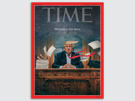
The 2016 election and new administration come accompanied by a renaissance of political image-making: The release of new cover art by magazines like Der Spiegel and Time are met with thousands of shares and retweets. Each photograph and illustration is analyzed and picked apart by commentators. And fomenting all of this is a protest movement with a flair for signage that remixes, reappropriates, and borrows the work of these artists.
Not since George Lois's iconic work for Esquire in the '60s has cover art enjoyed so much popular and critical success. It’s a fascinating time to be an illustrator, designer, or painter working on political subjects. Co.Design asked some of the voices and pens behind today’s iconic cover art about their work—and what’s changed in the past three months....
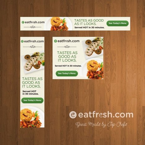
If you’re hoping to boost your online traffic with better ads, you may be asking yourself: what is web banner design? Web banner design focuses on the systematic creation of effective web banner ads through the careful application of basic design guidelines. Banner ads are one of the most prolific forms of marketing used in today’s online world. All companies use them in one form or another because they’re an affordable, measurable and effective medium to increase brand awareness. So how can you design and create web banner ads that will bring in those clicks? Below is a list of tips and general guidelines for designing banner ads....
|


Great design resources. Did I mention free?