
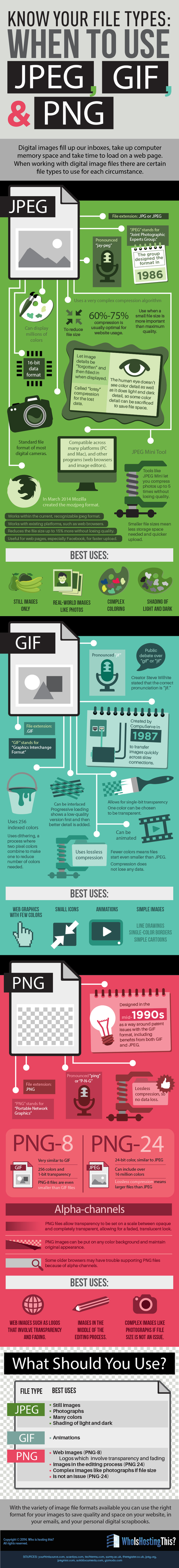

File types are a bit confusing to most people. Do you know when and why it's best to use a .jpeg, .gif, or .png? This infographic demystify the mystery.
Via Deb Nystrom, REVELN
Get Started for FREE
Sign up with Facebook Sign up with X
I don't have a Facebook or a X account

 Your new post is loading...

|
Scooped by Brian Yanish - MarketingHits.com from The Social Media Learning Lab |
File types are a bit confusing to most people. Do you know when and why it's best to use a .jpeg, .gif, or .png? This infographic demystify the mystery.
|
|
Scooped by Brian Yanish - MarketingHits.com from Must Design |

Hard Won Lessons
I spent almost a million dollars of OPM (Other People's Money) learning these five lessons about images and web design, so lessons learned the hard way:
1. Portraits Are Powerful
Portrait images where the model looks directly at the camera, are powerful "welcoming" images great for home, about and category "splash" pages.
2. Babies are DYNAMITE - Use Carefully
Thanks to our ancient caveman brain we can't NOT look at babies. Problem is that is not a secret so babies are now overused to hock insurance, tires and shampoo. If you use a baby my preference is to have the baby looking AT something.
Visitors eyes go where the eyes of people (or babies) are looking, so point your baby image directly at an important Call-to-Action and bet your conversions go up.
3. People Talking To Each Other = DANGEROUS
There may be context where it makes sense for you to have an image where people in the image are huddled together, but I doubt it. If you have two people huddled and a third looking directly out at the camera the image works better.
We respect a huddle. We don't want to intrude, so your web image is working against your online marketing purpose. Your image says we are here having a conversation and YOU (visitor) aren't invited. Not a good idea.
4. People Sell Better Than Widgets, but...
I prefer to tell human stories even about the most widgety widget, but people bring "like me" problems too. Every visitor is looking for "like me" signals. If you know your archetype and tribe well enough to risk it use images of people consistent with your understanding.
If you have a wide variety of customers and members best to avoid single archetype "like me" images. This is yet another reason I like portraits. Portraits are "universal" meaning the welcoming look directly at the camera removes some of the "must be like me to engage" requirements.
5. In Action Shots Use The MOVEMENT
If your image is riding a bicycle POINT the movement at something important. I don't like movement images as heroes (largest images on a page is called a hero), but I love them in "sub-hero" images because movement creates excitement and allows me to direct the visitor's eyes where we want them to go.

Having spent over a decade as a professional photographer, this is spot on! Of utmost interest to Experience Designers interested in persuasive design methodologies!
|
|
Scooped by Brian Yanish - MarketingHits.com from Curation Revolution |
Pushing web design forward too fast blows up trust from internal stake holders and visitors. There is an organic path the journey to online community takes.
Marty I agree. So many businesses still think "Build it and they will come".
The website gets built, they spend thousands promoting it and doing social media and yes the visitors come. One small problem no one discussed with the website development company or budgeted for follow up analytics and review of the design and content to see what changes can be made to improve the ux. So many visitor never comes back and that's where the problem is with most websites. Percentage of return visitors is key.
|
|
Scooped by Brian Yanish - MarketingHits.com from All Infographics |

Infographic on WhatsApp integrated with Facebook, a new UI/UX design, a tribute to $19 Billion Acquisition
|
|
Scooped by Brian Yanish - MarketingHits.com from Must Design |
We asked Randy Krum, Founder and President of InfoNewt, an infographic
design company, and editor of the Cool Infographics website, to share some
of his insights from working with and reviewing infographics.

Don't be fooled by infographic naysayers. Yes there are BAD infographics, yet when I tracked the top 10 for my 125,000 views on Scoopit Infographics owned more than half of almost every feed's top 10. Translation - we need to create infographics and other forms of data visualization.
Here are 3 great tips from an Infographic design pro:
* Keep It Clear.
* Be Iconic.
* Know the rules.
Come to think of it those tips apply to pretty much anything we lucky few Internet marketers do :). M

If 8 tips weren't enough, here are 3 more.
|
|
Scooped by Brian Yanish - MarketingHits.com from Must Design |
![EYES and How They MOVE Around A Website [infographic] | MarketingHits | Scoop.it](https://img.scoop.it/hq4_dMRx6ZSnPz9l40RoQzl72eJkfbmt4t8yenImKBVvK0kTmF0xjctABnaLJIm9)
Engage website visitors better by designing your site to match how people's eyes move on the page. Here are some surprising eye tracking stats to help.
Putting together a great looking website is a great start, but it is just a start.
True web design requires you to venture beyond the aesthetic and into the worlds of User Experience and Conversion Rate Optimization.
Knowing how the viewers of your site really see it can help to shine light on new and/or missed opportunities within your current design. It may also bring out the need for new elements or changes.
While there are plenty of options for improving CRO, eye tracking analysis provides some of the most useful information for optimizing your biggest digital marketing asset, your website.
A good design will catch people’s eye, but a great design will keep people on your site and get them engaged with your content. And while you shouldn’tunderestimate the power of good copy, your design is what people notice first.
We teamed up with our friends over at Single Grain to put together the infographic below in hopes that it will help everyone get a better, basic understanding of what eye tracking is and what it can do.


Designing clean, effective websites that work and deliver clients

One of my students' favorite topics... XD
|
|
Scooped by Brian Yanish - MarketingHits.com |
Infographics blog covering infographics, data visualization and visual thinking. Charts and graphs communicate data, infographics turn data into information.
|
|
Scooped by Brian Yanish - MarketingHits.com from Must Design |
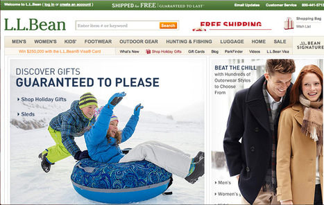
I'm not sure what to blame such a poor showing on basic holiday ecommerce design on, but this year's November crop is flat, uninspiring and junky.
L. L. Bean usually sets the holiday standard. This year their November offering is marred by an obnoxious animated image that includes their great Free Shipping Offer. I HATE putting such a great free shipping offer on a roll because it is easy to miss in the 5 to 9 seconds most visitors give a webpage before moving on (granted this is BEAN so maybe 15 seconds).
Bean has the tough job of competing with themselves and, in past holiday selling seasons, they define how to create great holiday look and feel. Holiday look and feel can be tough. I like Patagonia's approach - put up snow scenes AND a surfer on a massive wave (hey its Christmas in Hawaii too).
The other faux pas that is unforgivable after all these years is Free Shipping obfuscation. Many leading retailers are going free shipping all orders and some are going the Zappos route and offering free returns too. Of the 37 websites reviewed only 6 earned A ratings on three criteria:
* Free Shipping.
* Holiday Look and Feel.
* Holiday merchandising via categories such as For Him, Her, Kids.
The other big miss is websites who think they are too cool for the holidays (AE.com, Restoration Hardware). Black on black at the holidays is expensively too cool and self absorbed.
If you know smaller websites who know how to do the holidays right please share in comments or email Martin.Smith(at)Atlanticbt.com.

interesting topic on #ecommerce UX design. any other websites that you know are doing innovative desktop or mobile ecommerce design work?
|
|
Scooped by Brian Yanish - MarketingHits.com from Digital Presentations in Education |
This is my first slide deck designed to share. It reflects a summary and applied practice of some basic lessons learned about data visualization and information

The author Sheila B. Robinson has put together her ideas about planning and designing a PowerPoint presentation with the focus on education. This slideshow is like another lesson in mastering PowerPoint presentation skills.

|
|
Scooped by Brian Yanish - MarketingHits.com from visual data |
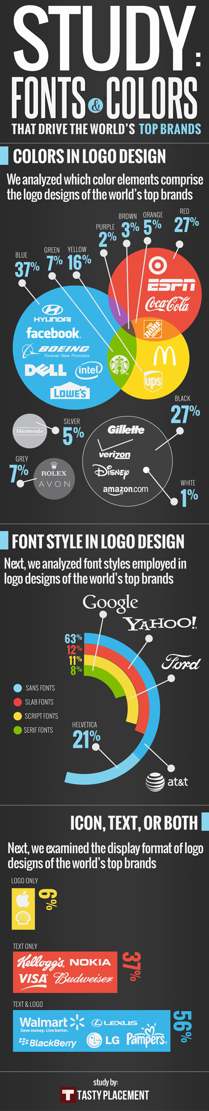
'We took a look at the world’s top 100 brands to determine which fonts, colors and formats were the most popular choices. Our infographic provides some good food for thought if you’ve hit a road block on your latest logo design.'
|
|
Scooped by Brian Yanish - MarketingHits.com from visual data |
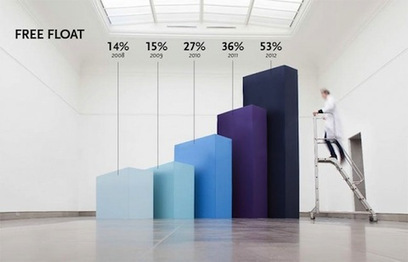
Belgian studio Coming Soon is all about making it big. Their Hand Lettering creations filled a giant chalkboard with letters in a variety of fonts and styles. And with Infographics XXXL, they’ve taken actual graphs and blown them up to a huge size for a client that specializes in the research of nanobodies.
The result is that, instead of casually glancing at the same old pie chart or bar graph, shareholders have something to keep their gaze on the numbers, like a blurry scientist walking by human-size bars or holding up a literal piece of the pie.
See a selection of Coming Soon’s giant infographics at the article link.
|
|
Scooped by Brian Yanish - MarketingHits.com from visual data |
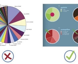
When it comes to visualizing data, it’s important to pick the right graph and the right kind of data range. Make it too detailed, and information gets lost and the reader leaves confused. Too simplified, and your data’s integrity is weakened.
Choosing the right infographic element shouldn’t be an art but common sense. After all, it’s an infographic – readers should get the gist of things at first glance and not have to get crossed-eyed in making sense of things...

General reference for basic visualization design elements, applications, and best practices...
|
|
Scooped by Brian Yanish - MarketingHits.com from Digital Presentations in Education |
Short explanation of Chip & Dan Heath's brilliant book 'Made to Stick' - Why some ideas take hold and others come unstuck. With the funny and sticky example by


Simple, Unexpected, Concrete, Credible, Emotional, Stories
|
|
Scooped by Brian Yanish - MarketingHits.com from visual data |
Want to create an attractive infographic but don’t have the budget to hire a professional designer?
Then you should try using an infographic-creation tool.
If your small business is looking for an eye-catching and easy to comprehend way to teach, inform, and inspire others about its products and services, infographics might be a good solution. Infographics can be more effective and memorable than other ways to present data, making them particularly effective for online audiences.
To create an infographic, you should make a list of possible ideas that you want to get across, create the initial draft or skeleton, color scheme it, and research your content from authoritative sites. Then it’s time to select your design platform.
Read about three online tools that can help you create stunning infographics...
|
|
Scooped by Brian Yanish - MarketingHits.com from Eclectic Technology |

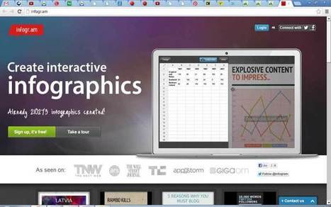
There are so many tools now available to help you make your own infographic, and this post shares information on ten tools that will help you visually represent data. For each tool a short description is provided as well as a visual. The tools discussed are: Visual.ly, Dipity, Easel.ly, Venngage, Infogr.am, Tableau Public, Photo Stats (for iPhone), What About Me? (create an infographic about your digital life), Gliffy, and Piktochart.
Ten great tools that will allow you to create (or have your students create) infographics for this school year!
|
|
Scooped by Brian Yanish - MarketingHits.com |


As my colleague, a graphic designer says, we aren't all graphic designers. How to "Know Your File Types" ~ Deb