

Content and social go together like peanut butter and jelly. It's key for marketers to learn how to both curate/create great content and build a solid social
Via Peg Corwin
Get Started for FREE
Sign up with Facebook Sign up with X
I don't have a Facebook or a X account

 Your new post is loading...
Content and social go together like peanut butter and jelly. It's key for marketers to learn how to both curate/create great content and build a solid social
5 curated, recent posts on B2B content marketing from Branding Mag, Hubspot, Demand Gen, Content Marketing Institute and Kiss Metrics,

|
Scooped by Brian Yanish - MarketingHits.com from Must Market |
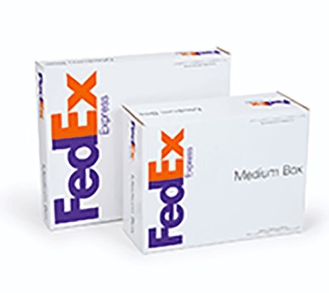
This original research by Internet Retailer offers insights into whats driving growth in sales conversion among Americas leading web merchants.
Marty Note
Listening to David Payton discuss the cool conversion report FedEx created with Internet Retailer:
1. Free Shipping = top way to convert visitors to buyers.
Some will even opt for a slower time for free shipping. Some want ship to store. Free shipping is "essential" said VP Marketing David Payton at SMB Conference today.
2. Responsive = device agnostic.
The ability to see the site and have the site function across platforms is key. Company in David's slide deck saw a 40% increase in conversion from responsive design.
3. Email Marketing Still Matters
David's and FedEx's study shows email is still very important. Persoans and personalizing emails is key. No more batch and blast.
4. Ratings and Reviews
Ratings and reviews boost online sales 62%. David referenced a Bazaar Voice review. Add one product review = 10% product review. From 0 to 30 increase 30%, 0 reviews to 100 = 37% sales increase.
5. Loyalty
Easier to sell those who are already in the boat. Make sure you value and reward those who are loyal to you.

Tony Randall By now most internet marketers are familiar with the phrase "Content is King" but this really is nothing new. It always has been king and it always will be.
|
|
Scooped by Brian Yanish - MarketingHits.com from Must Design |

Hard Won Lessons
I spent almost a million dollars of OPM (Other People's Money) learning these five lessons about images and web design, so lessons learned the hard way:
1. Portraits Are Powerful
Portrait images where the model looks directly at the camera, are powerful "welcoming" images great for home, about and category "splash" pages.
2. Babies are DYNAMITE - Use Carefully
Thanks to our ancient caveman brain we can't NOT look at babies. Problem is that is not a secret so babies are now overused to hock insurance, tires and shampoo. If you use a baby my preference is to have the baby looking AT something.
Visitors eyes go where the eyes of people (or babies) are looking, so point your baby image directly at an important Call-to-Action and bet your conversions go up.
3. People Talking To Each Other = DANGEROUS
There may be context where it makes sense for you to have an image where people in the image are huddled together, but I doubt it. If you have two people huddled and a third looking directly out at the camera the image works better.
We respect a huddle. We don't want to intrude, so your web image is working against your online marketing purpose. Your image says we are here having a conversation and YOU (visitor) aren't invited. Not a good idea.
4. People Sell Better Than Widgets, but...
I prefer to tell human stories even about the most widgety widget, but people bring "like me" problems too. Every visitor is looking for "like me" signals. If you know your archetype and tribe well enough to risk it use images of people consistent with your understanding.
If you have a wide variety of customers and members best to avoid single archetype "like me" images. This is yet another reason I like portraits. Portraits are "universal" meaning the welcoming look directly at the camera removes some of the "must be like me to engage" requirements.
5. In Action Shots Use The MOVEMENT
If your image is riding a bicycle POINT the movement at something important. I don't like movement images as heroes (largest images on a page is called a hero), but I love them in "sub-hero" images because movement creates excitement and allows me to direct the visitor's eyes where we want them to go.

Having spent over a decade as a professional photographer, this is spot on! Of utmost interest to Experience Designers interested in persuasive design methodologies!
|
|
Scooped by Brian Yanish - MarketingHits.com from Landing Page World |
Excerpt from the article:
Getting that guest blogging gig is one thing…actually getting subscribers and customers from it is quite another.
For example, if you land an article on a huge site like Lifehacker or Tim Ferriss’ blog, you are likely to create some serious traffic to your site.
The question is…is your site prepared to convert one percent of those visitors? Five percent? Ten percent?
Let’s get started!
1. Create an ultra-convincing byline
2. Create a landing page specific to that audience
3. Write a truly killer headline with the 4 U’s
4. Write killer copy using the PAS formula
5. Put call to action above the fold
6. Put a short video on the landing page
7. Request only the absolute bare minimum
8. Add social proof
9. Use killer design
10. Test
Curated by Agostino Caniato:
http://bit.ly/Landing-Page-World
To deepen the points just mentioned, read the entire article here: http://bit.ly/KJh03R


5 curated, recent posts on B2B content marketing from Branding Mag, Hubspot, Demand Gen, Content Marketing Institute and Kiss Metrics,