

You can add a chart or graph to a document in Google Docs.
Add a chart from Google Sheets Open a document in
Get Started for FREE
Sign up with Facebook Sign up with X
I don't have a Facebook or a X account


 Your new post is loading...
 Your new post is loading...
Your new post is loading...
You can add a chart or graph to a document in Google Docs. 
No comment yet.
Sign up to comment

Polychart is a free web service that lets you easily create Dashboards and charts from your existing database. It conveniently connects directly to where you store your data and works in browsers and on tablets so you can create charts and diagrams anywhere you are. You can also export your charts to PowerPoint, PDF and image formats. Via Baiba Svenca, James Funk

Baiba Svenca's curator insight,
June 21, 2013 4:21 PM
Read the review of Polychart which is a tool that lets you create and customize charts from your own data. Export your charts to PowerPoint, download as image or PDF. Watch the demo video that explains how to use Polychart https://www.polychart.com/ 
Lynn M. Miller's curator insight,
June 22, 2013 12:15 PM
Great article! *Professionalism with a Flair! #lmallc 
Wayne Turner's curator insight,
June 23, 2013 11:08 AM
I'm always looking for ways to graphically present complex information.
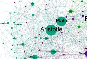
Each philosopher is a node in the network and the lines between them (or edges in the terminology of graph theory) represents lines of influence. The node and text are sized according to the number of connections. The algorithm that visualises the graph also tends to put the better connected nodes in the centre of the diagram so we the most influential philosophers, in large text, clustered in the centre. It all seems about right with the major figures in the western philosophical tradition taking the centre stage. (I need to also add the direction of influence with a arrow head – something I’ve not got round to yet.) A shortcoming however is that this evaluation only takes into account direct lines of influence. Indirect influence via another person in the network does not enter into it. This probably explains why Descartes is smaller than you’d think. It gets more interesting when we use Gephi to identify communities (or modules) within the network. Roughly speaking it identifies groups of nodes which are more connected with each other than with nodes in other groups. Philosophy has many traditions and schools so a good test would be whether the algorithm picks them out... Via Martin Daumiller, Lauren Moss
|
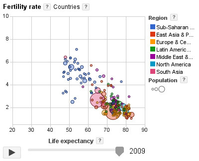
The Google Public Data Explorer makes large datasets easy to explore, visualize and communicate. As the charts and maps animate over time, the changes in the world become easier to understand. Via Patty Ball

Facebook is the only major social network in decline. Saudis share more online than anyone. You check your phone 150 times a day. And more.
Every year, Mary Meeker and the team from KPCB unleash upon the world the mother of all slideshows, which aims to sum up The State of the Internet. This year's behemoth was born this morning, weighing in at 117 pages. Here are the 12 most interesting pages. Check out the full report here. Via Lauren Moss
http://www.ted.com With the drama and urgency of a sportscaster, statistics guru Hans Rosling uses an amazing new presentation tool, Gapminder, to present da... Via Ana Cristina Pratas
|