25 Great Web Design Tips From Forbes
1. The 5 Second Rule **
2. Proper Messaging
3. Call to Action **
4. Building Trust
5. Keep it Fresh
6. Incorporating Social Media
7. Don’t Make Me Think **
8. Web 2.0 – It’s About the User’s Needs, Not About You
9. Video **
10. Don’t Reinvent The Wheel
11. Don’t Fall Behind – Your Competitors Will Beat You
12. Security
13. Start with SEO in Mind **
14. Avoid Long Page Forms
15. Don’t Make Me Squint
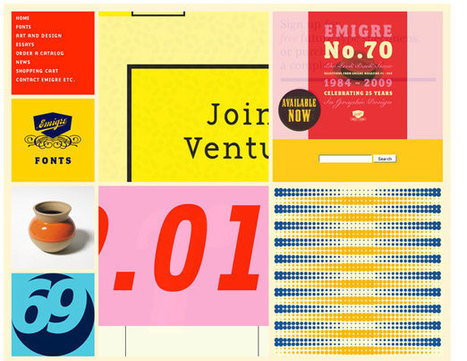
16. Be an Industry Leader
17. It’s No Longer Just About the Desktop
18. Don’t Attempt to Target Everyone
19. Monitor Site Performance
20. It’s Web Pages, Not Websites That Rank
21. Your Website is a Component of Marketing
22. Good websites grow businesses.
23. Flash is dead.
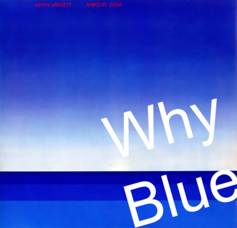
24. Respect text.
25. Future requires wearable tech integration.
All 25 are great web design tips. Our favorite 5 are highlighted in bold.


 Your new post is loading...