
15 examples of data visualizations that will give you a clearer understanding of what makes a good visualization--and what makes a bad one.
Get Started for FREE
Sign up with Facebook Sign up with X
I don't have a Facebook or a X account


|
Suggested by
Belle Balace
onto Big Data & Digital Marketing |
15 examples of data visualizations that will give you a clearer understanding of what makes a good visualization--and what makes a bad one.


 Your new post is loading...


A list of awesome visualisations!
Not only are they clear and beautiful, but also they keep you focused on the subject and succeed in conveying the story behind the data.
If you need to stimulate your creativity for your next dashboard or infographics have a close look at them!
Here is my list of top 5:
1. Are we alone?
Stimulate user’s imagination
http://www.bbc.com/future/story/20120821-how-many-alien-worlds-exist
2. Here is today
Give perspective
http://hereistoday.com/
http://www.nytimes.com/interactive/2010/11/13/weekinreview/deficits-graphic.html
4. The Internet map
Exploit metaphors
http://internet-map.net/
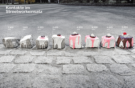
5. Infographics with Real images
http://marion-luttenberger.squarespace.com/#/infographics/